STATISTICAL PROCESS CONTROL

Traditional quality control is designed to prevent the production of products that do not meet certain acceptance criteria. This could be accomplished by performing inspection on products that, in many cases, have already been produced. Action could then be taken by rejecting those products. Some products would go on to be reworked, a process that is costly and time consuming. In many cases, rework is more expensive than producing the product in the first place. This situation often results in decreased productivity, customer dissatisfaction, loss of competitive position, and higher cost.
To avoid such results, quality must be built into the product and the processes. Statistical process control (SPC), a term often used interchangeably with statistical quality control (SQC), involves the integration of quality control into each stage of producing the product. In fact, SPC is a powerful collection of tools that implement the concept of prevention as a shift from the traditional quality by inspection/correction.
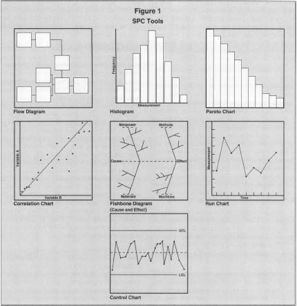
SPC is a technique that employs statistical tools for controlling and improving processes. SPC is an important ingredient in continuous process improvement strategies. It uses simple statistical means to control, monitor, and improve processes. All SPC tools are graphical and simple to use and understand, as shown in Figure 1.
UNDERSTANDING VARIATION
The main objective of any SPC study is to reduce variation. Any process can be considered a transformation mechanism of different input factors into a product or service. Since inputs exhibit variation, the result is a combined effect of all variations. This, in turn, is translated into the product. The purpose of SPC is to isolate the natural variation in the process from other sources of variation that can be traced or whose causes may be identified. As follows, there are two different kinds of variation that affect the quality characteristics of products.
COMMON CAUSES OF VARIATION.
Variation due to common causes are inherent in the process; they are inevitable and can be represented by a normal distribution. Common causes are also called chance causes
SPC Tools
SPECIAL CAUSES OF VARIATION.
Special causes, also called assignable causes of variation, are not part of the process. They can be traced, identified, and eliminated. Control charts are designed to hunt for those causes as part of SPC efforts to improve the process. A process with the presence of special or assignable cause of variation is unpredictable or inconsistent, and the process is said to be out of statistical control.
STATISTICAL PROCESS CONTROL (SPC)
TOOLS
Among the many tools for quality improvement, the following are the most commonly used tools of SPC:
- histograms
- cause-and-effect diagrams
- Pareto diagrams
- control charts
- scatter or correlation diagrams
- run charts
- process flow diagrams
Figure 1 shows the seven basic tools of statistical process control, sometimes known as the "magnificent 7."
HISTOGRAMS.
Histograms are visual charts that depict how often each kind of variation occurs in a process. As with all SPC tools, histograms are generally used on a representative sample of output to make judgments about the process as a whole. The height of the vertical bars on a histogram shows how common each type of variation is, with the tallest bars representing the most common outcomes. Typically a histogram documents variations at between 6 and 20 regular intervals along some continuum (i.e., categories made up of ranges of process values, such as measurement ranges) and shows the relative frequency that products fall into each category of variation.
For example, if a metal-stamping process is supposed to yield a component with a thickness of 10.5 mm, the range of variation in a poorly controlled process might be between 9 mm and 12 mm. The histogram of this output would divide it into several equal categories within the range (say, by each half millimeter) and show how many parts out of a sample run fall into each category. Under a normal distribution (i.e., a bell curve) the chart would be symmetrical on both sides of the mean, which is normally the center category. Ideally, the mean is also well within the specification limits for the output. If the chart is not symmetrical or the mean is skewed, it suggests that the process is particularly weak on one end. Thus, in the stamping example, if the chart is skewed toward the lower end of the size scale, it might mean that the stamping equipment tends to use too much force.
Still, even if the chart is symmetrical, if the vertical bars are all similar in size, or if there are larger bars protruding toward the edges of the chart, it suggests the process is not well controlled. The ideal histogram for SPC purposes has very steep bars in the center that drop off quickly to very small bars toward the outer edges.
PARETO CHARTS.
Pareto charts are another powerful tool for statistical process control and quality improvement. They go a step further than histograms by focusing the attention on the factors that cause the most trouble in a process. With Pareto charts, facts about the greatest improvement potential can be easily identified.
A Pareto chart is also made up of a series of vertical bars. However, in this case the bars move from left to right in order of descending importance, as measured by the percentage of errors caused by each factor. The sum of all the factors generally accounts for 100 percent of all errors or problems; this is often indicated with a line graph superimposed over the bars showing a cumulative percentage as of each successive factor.
A hypothetical Pareto chart might consist of these four explanatory factors, along with their associated percentages, for factory paint defects on a product: extraneous dust on the surface (75 percent), temperature variations (15 percent), sprayer head clogs (6 percent), and paint formulation variations (4 percent). Clearly, these figures suggest that, all things being equal, the most effective step to reduce paint defects would be to find a procedure to eliminate dust in the painting facility or on the materials before the process takes place. Conversely, haggling with the paint supplier for more consistent paint formulations would have the least impact.
CAUSE-AND-EFFECT DIAGRAMS.
Cause-and-effect diagrams, also called Ishikawa diagrams or fishbone diagrams, provide a visual representation of the factors that most likely contribute to an observed problem or an effect on the process. They are technically not statistical tools—it requires no quantitative data to create one—but they are commonly employed in SPC to help develop hypotheses about which factors contribute to a quality problem. In a cause-and-effect diagram, the main horizontal line leads toward some effect or outcome, usually a negative one such as a product defect or returned merchandise. The branches or "bones" leading to the central problem are the main categories of contributing factors, and within these there are often a variety of subcategories. For example, the main causes of customer turnover at a consumer Internet service provider might fall into the categories of service problems, price, and service limitations. Subcategories under service problems might include busy signals for dial up customers, server outages, e-mail delays, and so forth. The relationships between such factors can be clearly identified, and therefore, problems may be identified and the root causes may be corrected.
SCATTER DIAGRAMS.
Scatter diagrams, also called correlation charts, show the graphical representation of a relationship between two variables as a series of dots. The range of possible values for each variable is represented by the X and Y axes, and the pattern of the dots, plotted from sample data involving the two variables, suggests whether or not a statistical relationship exists. The relationship may be that of cause and effect or of some other origin; the scatter diagram merely shows whether the relationship exists and how strong it is. The variables in scatter diagrams generally must be measurable on a numerical scale (e.g., price, distance, speed, size, age, frequency), and therefore categories like "present" and "not present" are not well suited for this analysis.
An example would be to study the relationship between product defects and worker experience. The researcher would construct a chart based on the number of defects associated with workers of different levels of experience. If there is a statistical relationship, the plotted data will tend to cluster in certain ways. For instance, if the dots cluster around an upward-sloping line or band, it suggests there is a positive correlation between the two variables. If it is a downward-sloping line, there may be a negative relationship. And if the data points are spread evenly on the chart with no particular shape or clustering, it suggests no relationship at all. In statistical process control, scatter diagrams are normally used to explore the relationships between process variables and may lead to identifying possible ways to increased process performance.
CONTROL CHARTS.
Considered by some the most important SPC tool, control charts are graphical representations of process performance over time. They are concerned with how (or whether) processes vary at different intervals and, specifically, with identifying nonrandom or assignable causes of variation. Control charts provide a powerful analytical tool for monitoring process variability and other changes in process mean or variability deterioration.
Several kinds of control charts exist, each with its own strengths. One of the most common is the Χ̅ chart, also known as the Shewhart Χ̅ chart after its inventor, Walter Shewhart. The Χ̅ symbol is used in statistics to indicate the arithmetic mean (average) of a set of sample values (for instance, product measurements taken in a quality control sample). For control charts the sample size is often quite small, such as just four or five units chosen randomly, but the sampling is repeated periodically. In an Χ̅ chart the average value of each sample is plotted and compared to averages of previous samples, as well as to expected levels of variation under a normal distribution.
Four values must be calculated before the Χ̅ chart can be created:
- The average of the sample means (designated as Χ̅d̅ since it is an average of averages)
- The upper control limit (UCL), which suggests the highest level of variation one would expect in a stable process
- The lower control limit (LCL), which is the lowest expected value in a stable process
- The average of range R (labeled R̅), which represents the mean difference between the highest and lowest values in each sample (e.g., if sample measurements were 3.1, 3.3, 3.2, and 3.0, the range would be 3.3 - 3.0 = 0.3)
While the values of Χ̅d̅ and R̅ can be
determined directly from the sample data, calculating the UCL and LCL
requires a special probability multiplier (often given in tables in
statistics texts)
A
2
. The UCL and LCL approximate the distance of three standard deviations
above and below the mean, respectively. The simplified formulas are as
follows:
where Χ̅d̅ is the mean of the sample means
A
2
is a constant multiplier based on the sample size
R̅ is the mean of the sample ranges
Graphically, the control limits and the overall mean Χ̅d̅ are drawn as a continuum made up of three parallel horizontal lines, with UCL on top, Χ̅d̅ in the middle, and LCL on the bottom. The individual sample means (Χ̅) are then plotted along the continuum in the order they were taken (for example, at weekly intervals). Ideally, the Χ̅ values will stay within the confines of the control limits and tend toward the middle along the Χ̅d̅ line. If, however, individual sample values exceed the upper or lower limits repeatedly, it signals that the process is not in statistical control and that exploration is needed to find the cause. More advanced analyses using Χ̅ charts also consider warning limits within the control limits and various trends or patterns in the Χ̅ line.
Other widely used control charts include R charts, which observe variations in the expected range of values and cumulative sum (CUSUM) charts, which are useful for detecting smaller yet revealing changes in a set of data.
RUN CHARTS.
Run charts depict process behavior against time. They are important in investigating changes in the process over time, such as predictable cycles. Any changes in process stability or instability can be judged from a run chart. They may also be used to compare two separate variables over time to identify correlations and other relationships.
FLOW DIAGRAMS.
Process flow diagrams or flow charts are graphical representations of a process. They show the sequence of different operations that make up a process. Flow diagrams are important tools for documenting processes and communicating information about processes. They can also be used to identify bottlenecks in a process sequence, to identify points of rework or other phenomena in a process, or to define points where data or information about process performance need to be collected.
PROCESS CAPABILITY ANALYSIS
Process capability is determined from the total variations that are caused only by common causes of variation after all assignable causes have been removed. It represents the performance of a process that is in statistical control. When a process is in statistical control, its performance is predictable and can be represented by a probability distribution.
The proportion of production that is out of specification is a measure of the capability of the process. Such proportion may be determined using the process distribution. If the process maintains its status of being in statistical control, the proportion of defective or nonconforming production remains the same.
Before assessing the capability of the process, it must be brought first to a state of statistical control. There are several ways to measure the capability of the process:
USING CONTROL CHARTS.
When the control chart indicates that the process is in a state of statistical control, and when the control limits are stable and periodically reviewed, it can be used to assess the capability of the process and provide information to infer such capability.
NATURAL TOLERANCE VERSUS SPECIFICATION
LIMITS.
The natural tolerance limits of a process are normally these limits between which the process is capable of producing parts. Natural tolerance limits are expressed as the process mean plus or minus z process standard deviation units. Unless otherwise stated, z is considered to be three standard deviations.
There are three situations to be considered that describe the relationship between process natural tolerance limits and specification limits. In case one, specification limits are wider than the process natural tolerance limits. This situation represents a process that is capable of meeting specifications. Although not desirable, this situation accommodates, to a certain degree, some shift in the process mean or a change in process variability.
In case two, specification limits are equal to the process natural tolerance limits. This situation represents a critical process that is capable of meeting specifications only if no shift in the process mean or a change in process variability takes place. A shift in the process mean or a change in its variability will result in the production of nonconforming products. When dealing with a situation like this, care must be taken to avoid producing products that are not conforming to specifications.
In case three, specification limits are narrower than the process natural tolerance limits. This situation guarantees the production of products that do not meet the desired specifications. When dealing with this situation, action should be taken to widen the specification limits, to change the design of the product, and to control the process such that its variability is reduced. Another solution is to look for a different process altogether.
SEE ALSO : Total Quality Management (TQM)
FURTHER READING:
Fine, Edmund S. "Use Histograms to Help Data Communicate." Quality, May 1997.
Juran. Joseph M., and A. Blanton Godfrey, eds. Juran's Quality Handbook. 5th ed. New York: McGraw-Hill, 1998.
Maleyeff, John. "The Fundamental Concepts of Statistical Quality Control." Industrial Engineering, December 1994. Schuetz, George. "Bedrock SQC." Modern Machine Shop, February 1996.